All homeowners under one roof.
Vereniging Eigen Huis — Identity, Strategy, Typography
The challenge
Vereniging Eigen Huis is the Netherlands’ largest homeowners’ association, dedicated to making homeownership clearer and more accessible through independent advice, legal support and advocacy. Yet its brand lacked the warmth and approachability needed to connect with a diverse audience of homeowners. The existing identity felt formal and institutional, and didn’t reflect the association’s mission: to empower and guide people through one of the biggest investments of their lives.
The strategy
Instead of focusing on the association’s services, we centred the brand on the people it serves: homeowners finding their way through everything that comes with owning a home. We set out to make the brand more human, so it feels like a trusted partner rather than a distant authority. The visual system had to be friendly, clear and personal, in line with the association’s role as a supportive guide.
The solution
Keeping the existing logo, we developed a coherent visual system to bring the brand to life. It includes:
- a custom typeface that improves readability and distinctiveness;
- friendly illustrations and charts that make complex information simpler and more engaging;
- a flexible layout system that works across platforms, consistent yet leaving room for variation;
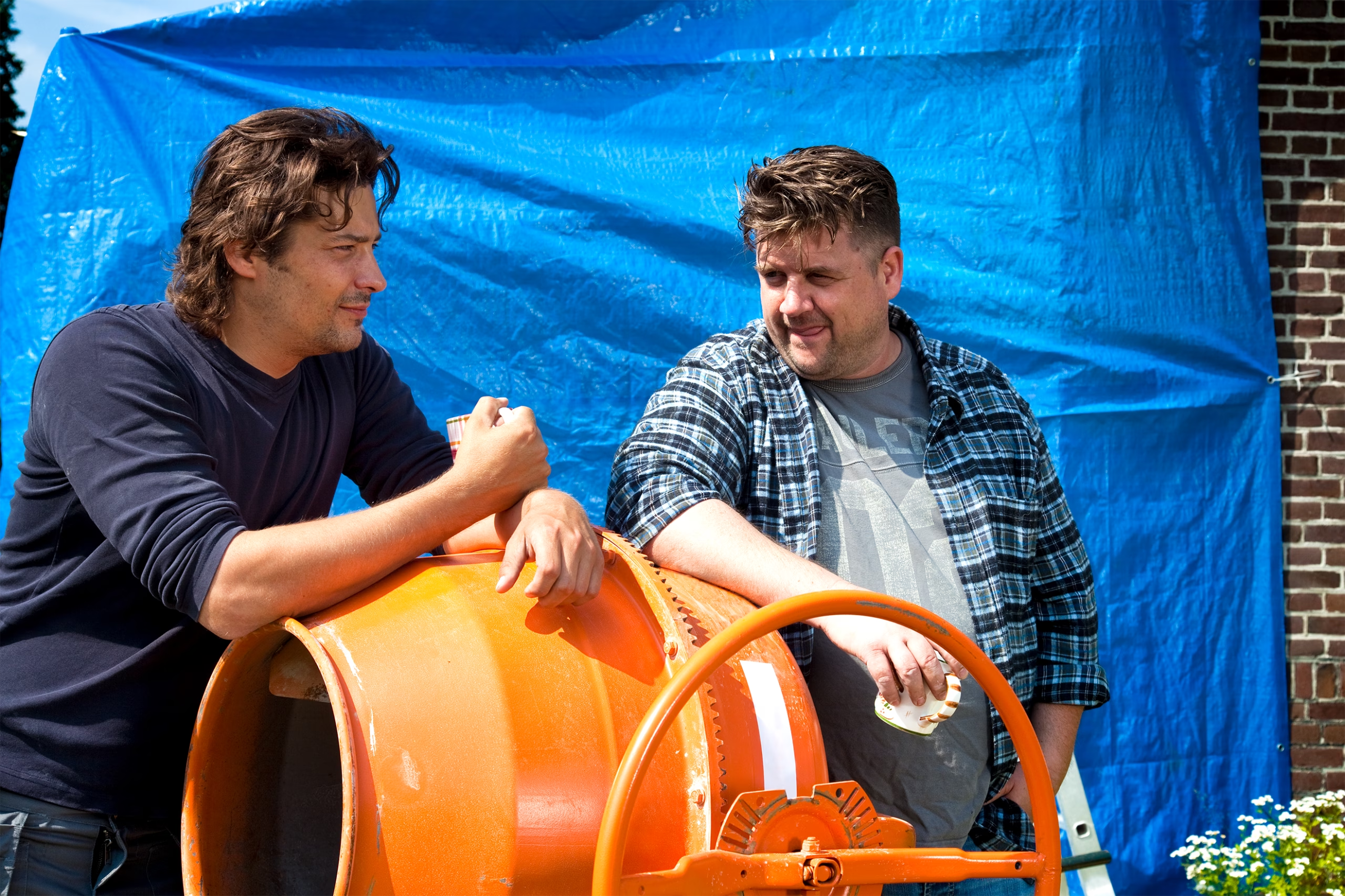
- honest photography that reflects the real experiences of homeowners.
The result is a brand that feels approachable, modern and human, while keeping the professionalism and reliability Vereniging Eigen Huis is known for.
A friendly touch
The identity makes the world of housing and homeownership approachable and easy to understand. Playful house shapes, rounded typography and clear design choices strip away complexity and create a welcoming look and feel, helping everyone feel at home in a subject that often seems complicated.


What’s hard to explain, we made visible
To tackle complex topics, we developed a distinctive set of illustrations: simple, direct and full of character. They bring abstract concepts down to earth. From clear, data-driven infographics to isometric floor plans, the illustration style is a versatile toolbox used across campaigns, reports and digital platforms.


From a custom typeface to photoshoots
For Vereniging Eigen Huis, typography and photography carry the identity. Every touchpoint needs to communicate clarity, warmth and a straightforward attitude. Alongside the visual language and custom typeface, we art-directed photoshoots that capture the full spectrum of homeownership, celebrating everyday joys while acknowledging the challenges. Together, honest photography and distinctive typography create a visual language that feels real and relatable.


