Een merk gedreven door ontdekking.
Nederlands Kanker Instituut — Identiteit, Motion, Strategie
The Challenge
The Netherlands Cancer Institute (NKI), part of the Antoni van Leeuwenhoek hospital, is one of the world’s leading cancer research centres. But its brand didn’t reflect the energy inside its walls. It felt institutional, academic and rooted in the past, while the institute itself is driven by a new generation of bold, curious researchers.
The Strategy
Rather than building the brand around the institution, we built it around the people. The scientists behind every breakthrough. Researchers with bold ideas, curious minds and an unwavering drive to push science forward. Their spirit became the core of our strategy.
The Solution
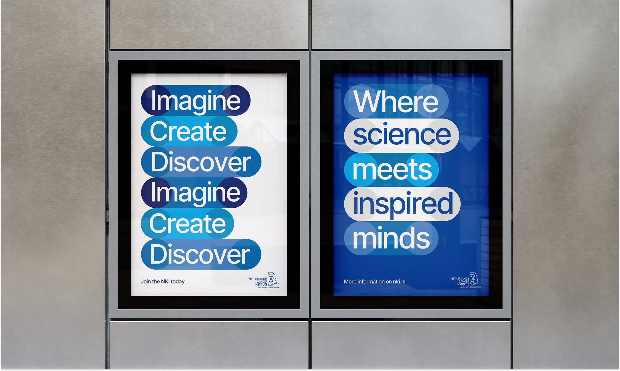
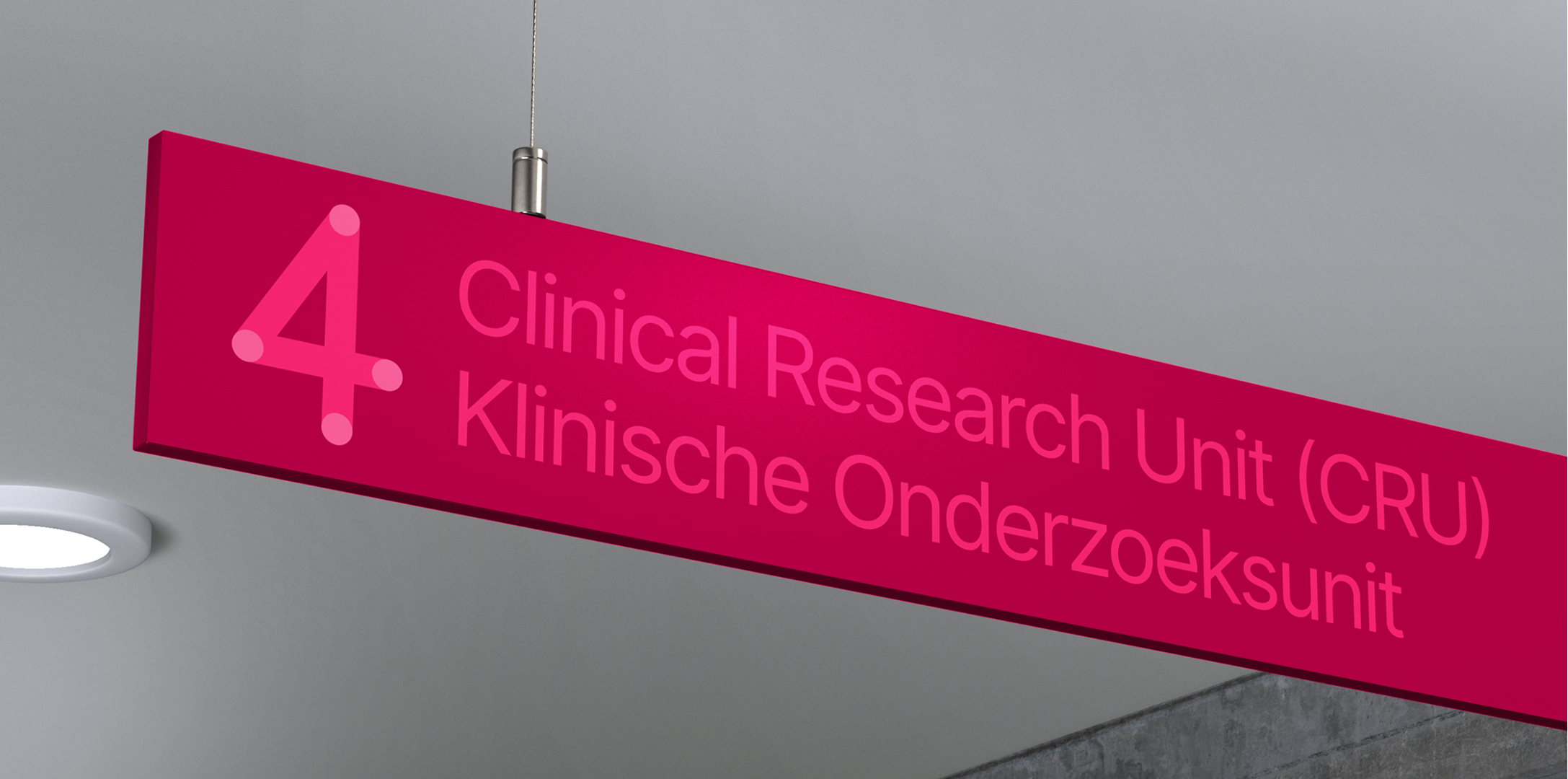
Building on the existing logo, we introduced a fresh approach to their visual identity, creating a recognisable visual system built around colourful cells. Reflecting on how breakthroughs occur, the cells link, cluster and play off each other, putting the voices and visions of the young researchers first.

In gesprek met Karlijn
“Branding draait eigenlijk om wie je bent en hoe je overkomt. Het NKI kwam voorheen over als serieus en streng. De nieuwe identiteit heeft als doel om die perceptie te veranderen. Voor NKI betekent dat: niet alleen onze leidende positie tonen, maar ook meer van onze speelsheid en moed.”
Karlijn van Driel – Senior Communicatie Adviseur bij NKI
Next project
Elk scherm is belangrijk.
Movies That Matter – Identiteit, Strategie