Space between the lines
Poetry Circle — Identity, Motion, Strategie
The Challenge
Poetry Circle makes poetry and spoken word accessible to (young) makers. With training, room to develop and a community to fall back on, it offers a place where talent can grow. Because here, poetry isn’t elitist or purely literary. It belongs to everyone.
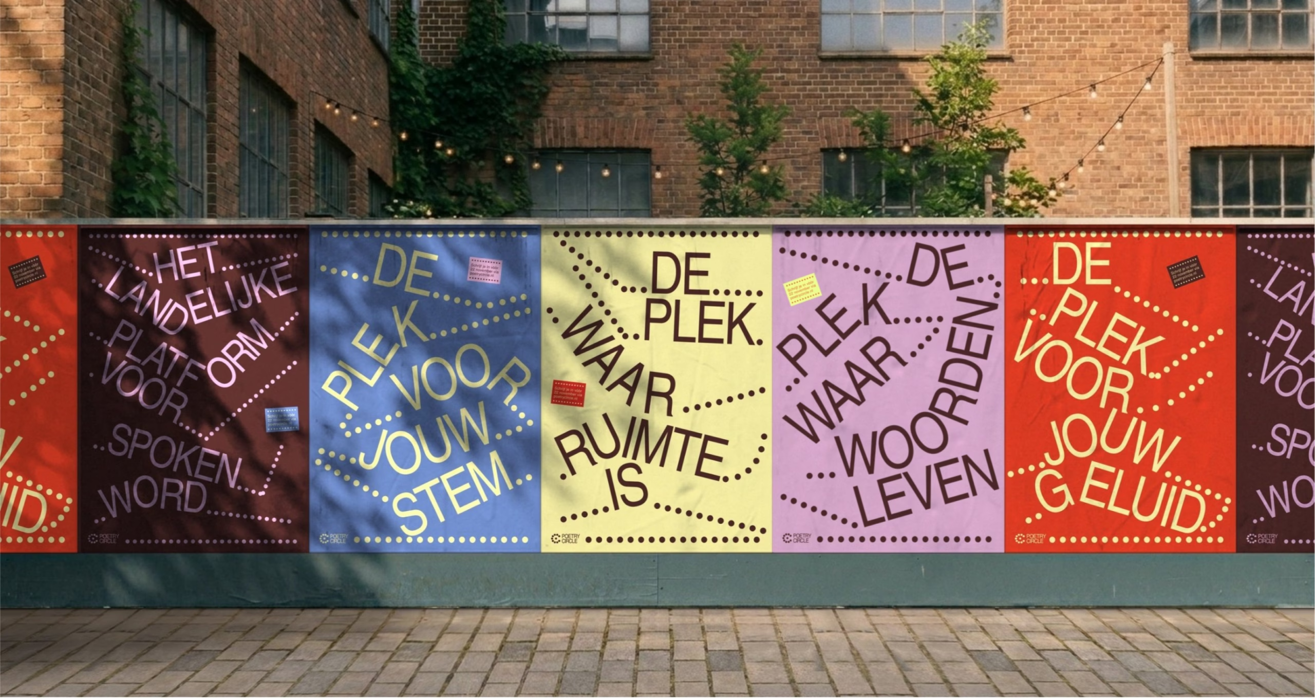
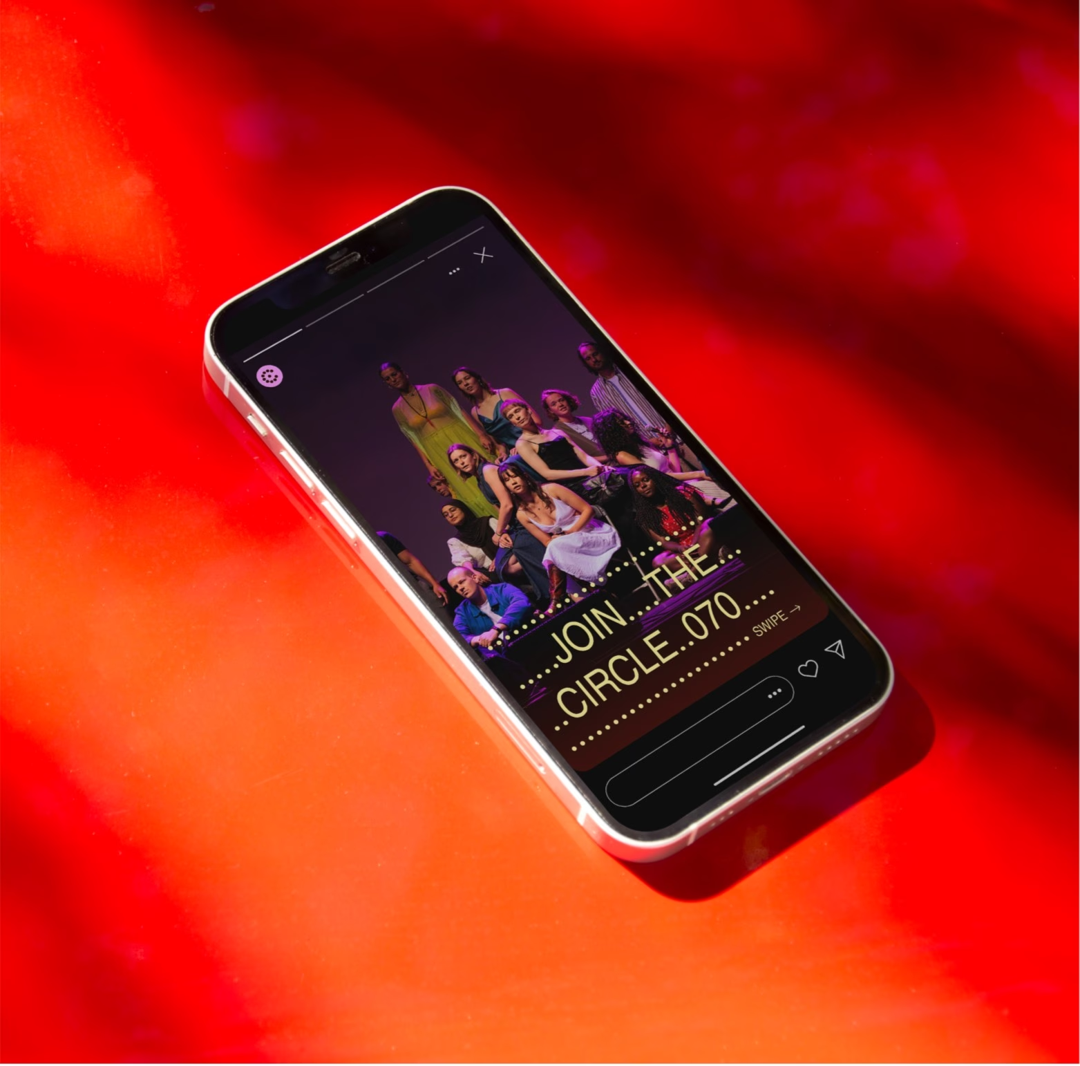
Building on a widely embraced icon, the task was to create a new brand identity that is unmistakably Poetry Circle. An identity that holds up across every medium and makes an instant impression whenever it has the spotlight.
The Strategy
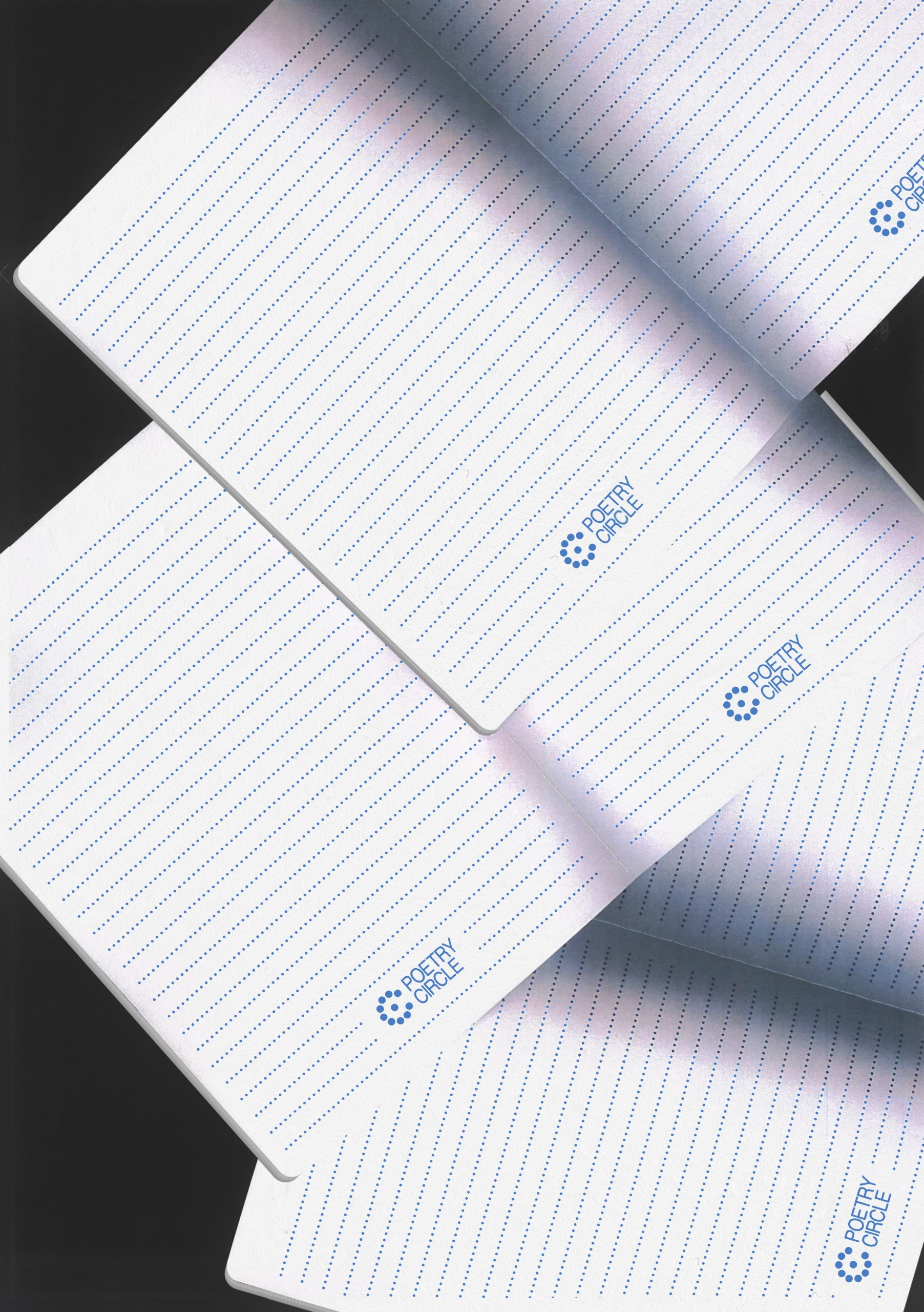
Our starting point was the empty notebook. A beginning that is the same for everyone, whether you’re an experienced artist or just starting to write. Because everyone starts somewhere, and everyone has something to say. At Poetry Circle, these voices come together and everyone gets the space to discover, experiment and express themselves in their own way.
The Solution
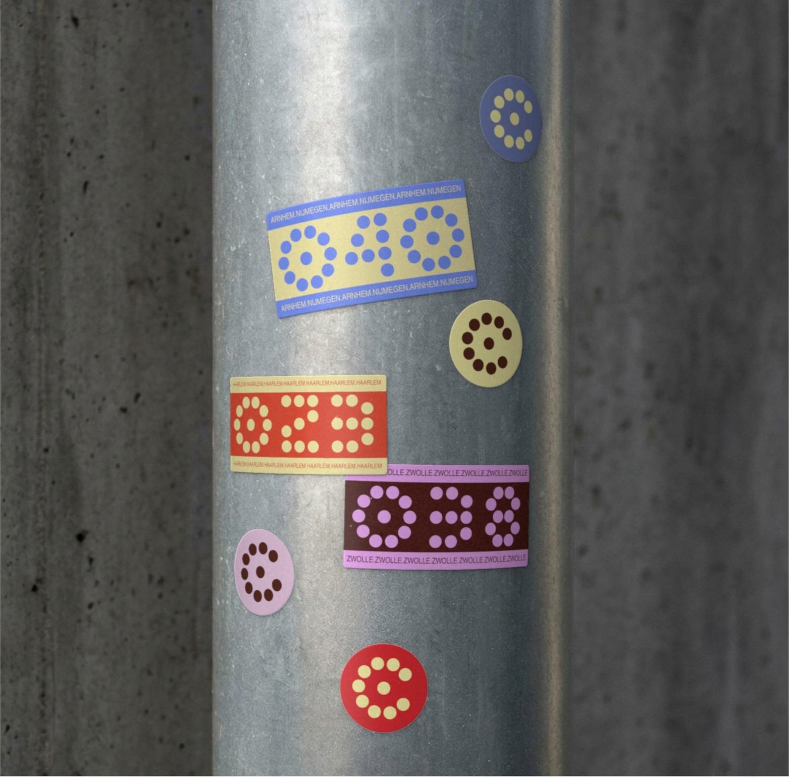
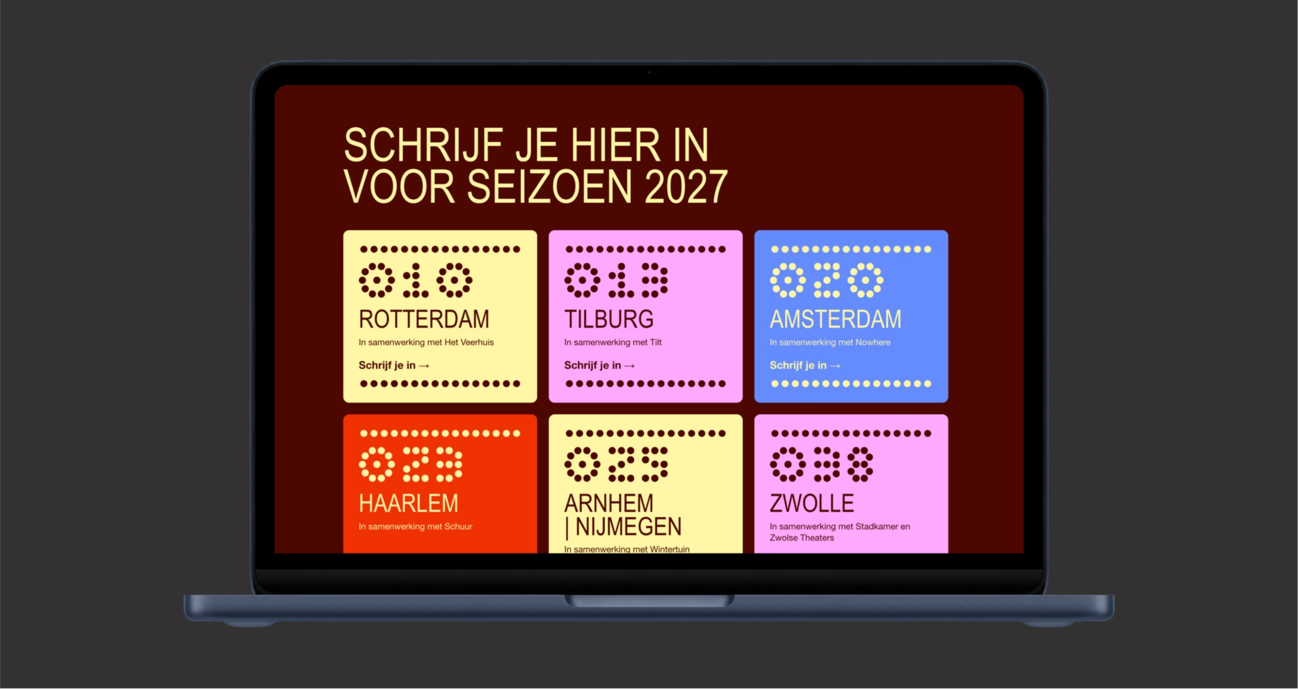
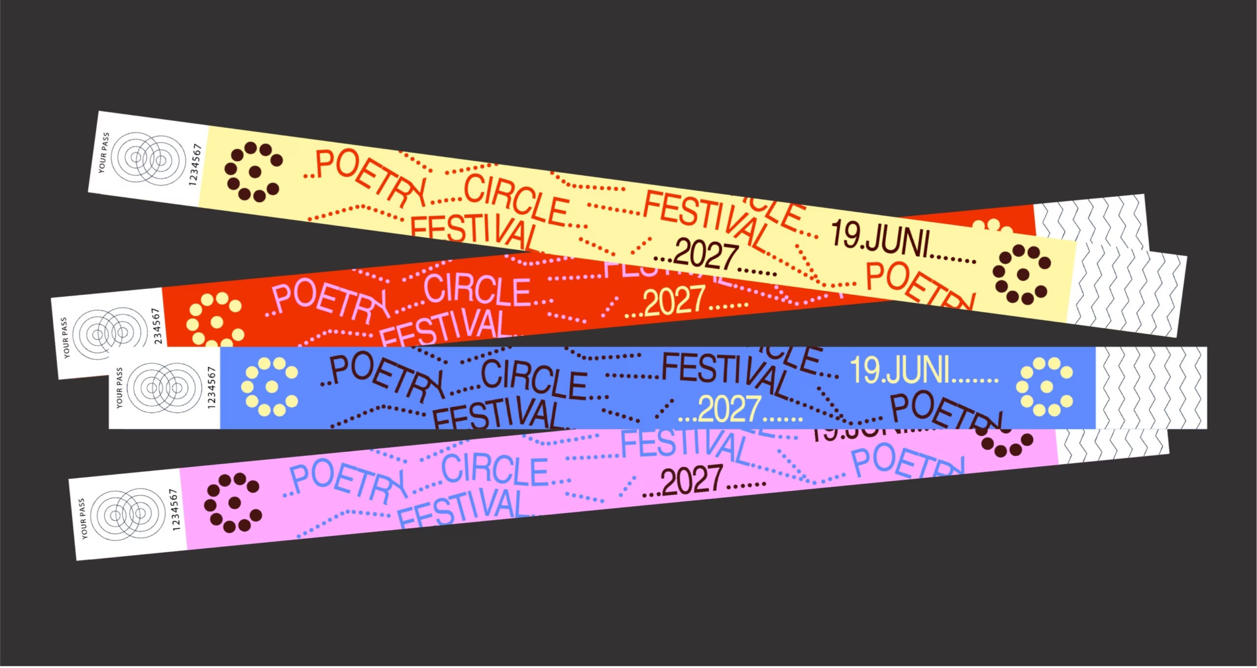
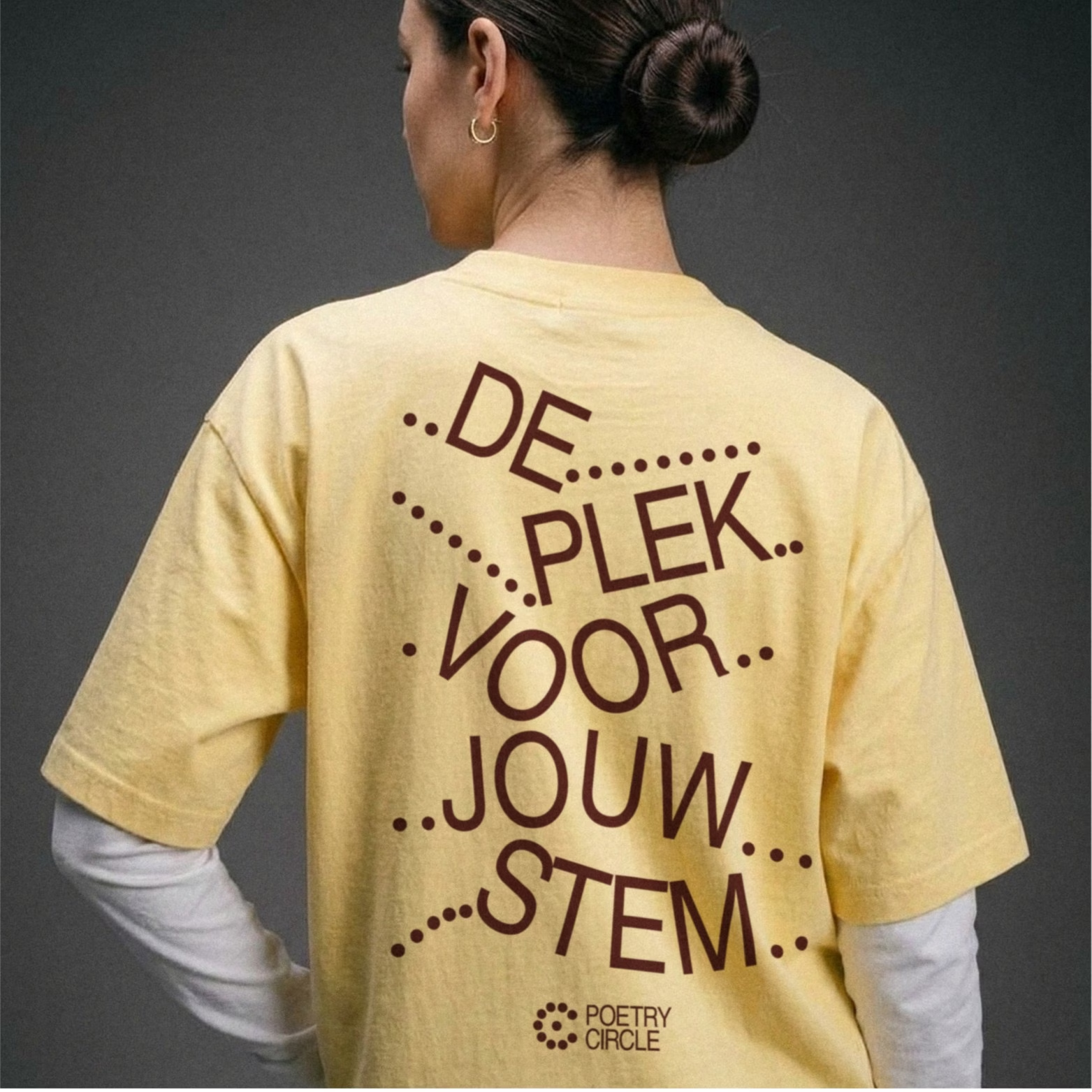
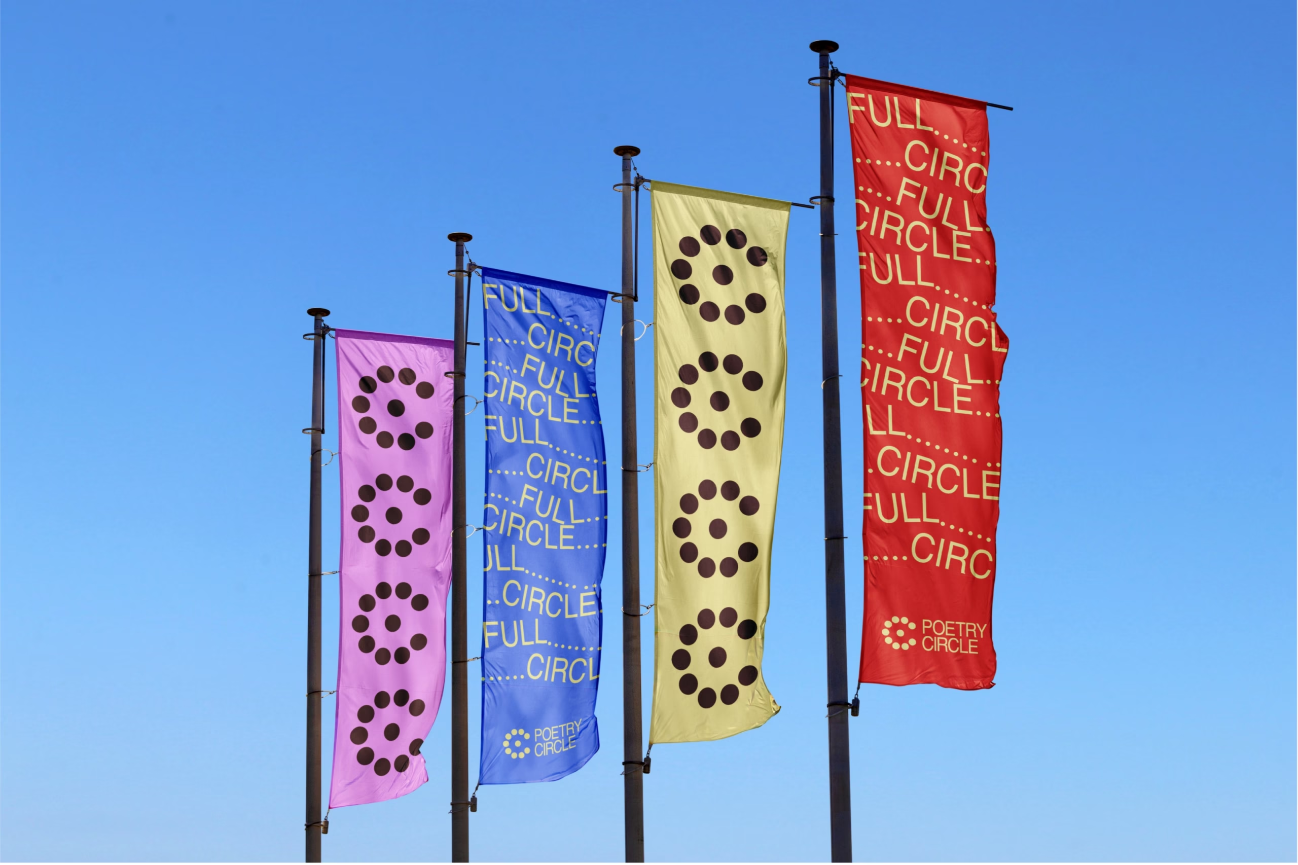
We translated the ruled line of the notebook into an overarching principle of space. It forms the foundation of the entire identity, from the renewed icon to the custom region codes. The brand revolves around typography, language and a bold colour palette. A tight graphic system provides the framework, while the type and words within it constantly push against its boundaries.