A brand driven by discovery.
Netherlands Cancer Institute — Identity, Motion, Strategy
The Challenge
The Netherlands Cancer Institute (NKI), part of the Antoni van Leeuwenhoek hospital, is one of the world’s leading cancer research centres. But its brand didn’t reflect the energy inside its walls. It felt institutional, academic and rooted in the past, while the institute itself is driven by a new generation of bold, curious researchers.
The Strategy
Rather than building the brand around the institution, we built it around the people. The scientists behind every breakthrough. Researchers with bold ideas, curious minds and an unwavering drive to push science forward. Their spirit became the core of our strategy.
The Solution
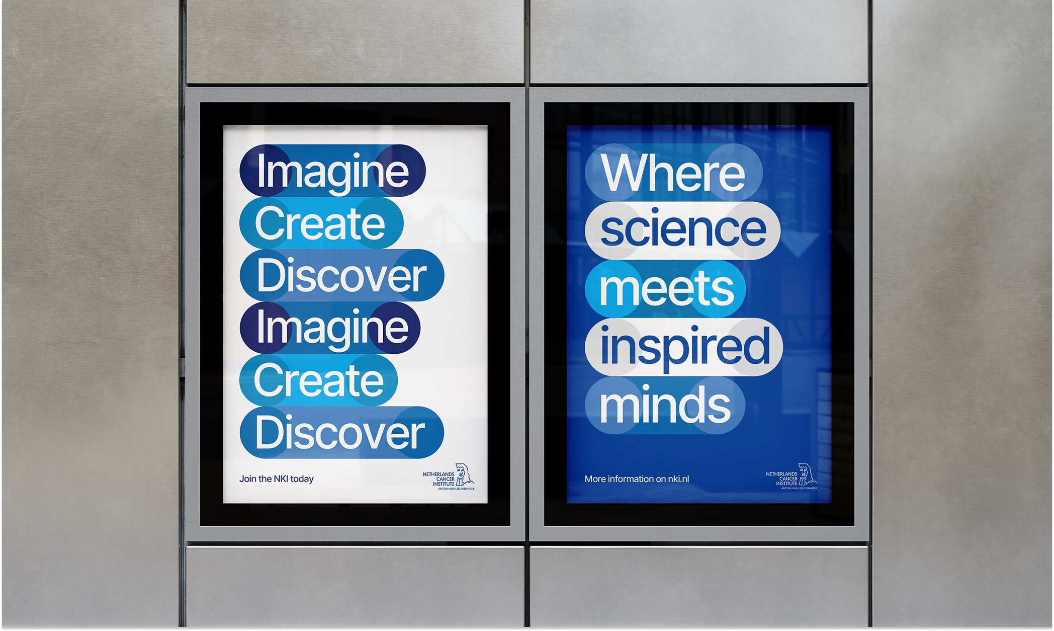
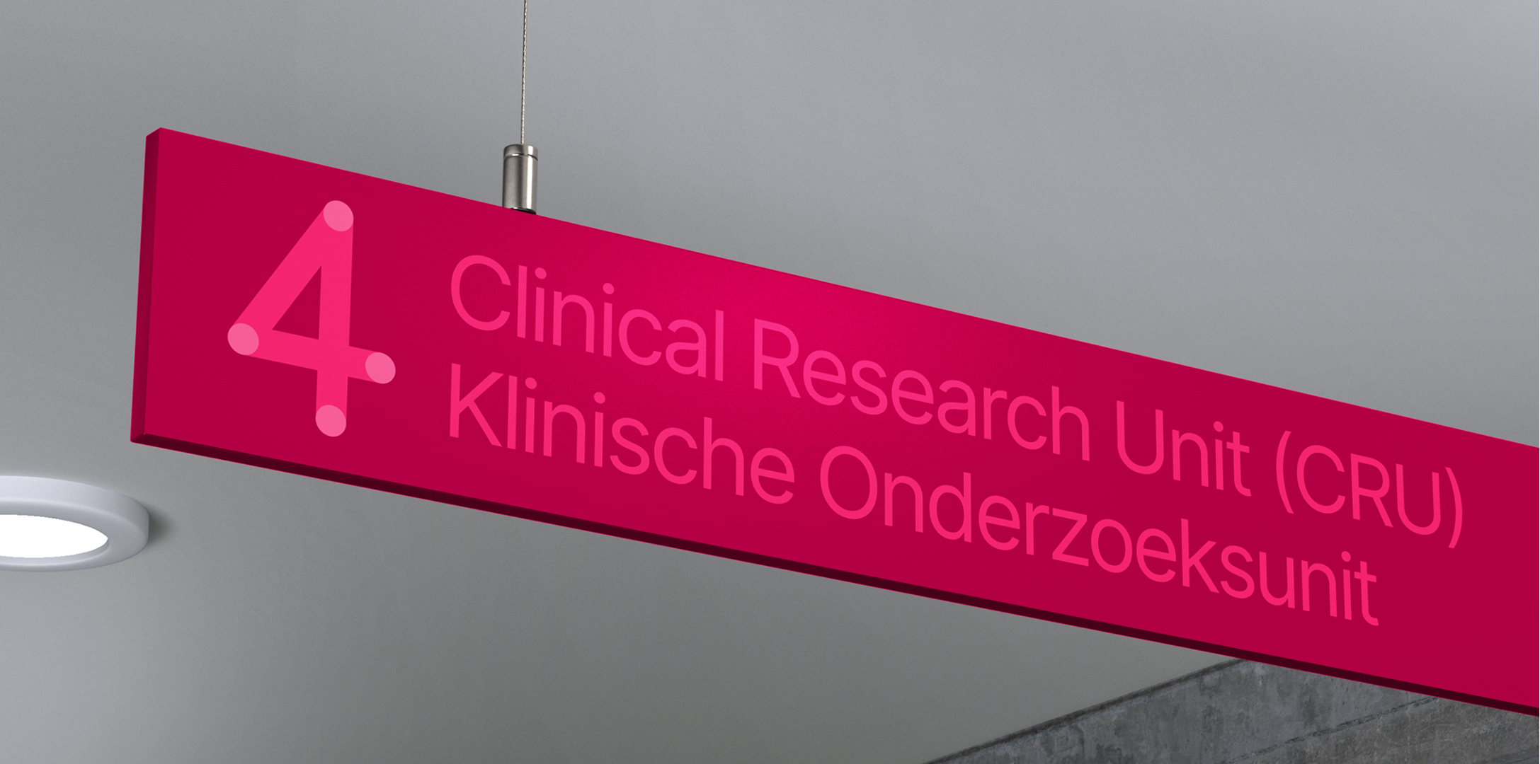
Building on the existing logo, we introduced a fresh approach to their visual identity, creating a recognisable visual system built around colourful cells. Reflecting on how breakthroughs occur, the cells link, cluster and play off each other, putting the voices and visions of the young researchers first.

In conversation with Karlijn
“Branding is really about who you are and how you come across. The NKI used to come across as serious and rigorous. The new identity aims to shift that perception. For NKI, that means showing not only our leading position, but also more of our playfulness and boldness.”
Karlijn van Driel – Senior Communications Advisor at NKI