Uniting all home owners under one roof.
Vereniging Eigen Huis — Identity, Strategy, Typography
Vereniging Eigen Huis is the Netherlands’ largest homeowners’ association, offering independent advice, legal support, and advocacy to make homeownership clearer and more accessible.
With the existing logo left intact, we focused on everything around it. A friendly visual system was developed that includes a custom typeface, cohesive illustrations and graphs, photography, and a flexible layout system that brings clarity and character to their communication.
A friendly touch
The identity for Vereniging Eigen Huis is designed to make the world of housing and homeownership approachable and easy to understand. Playful house shapes, rounded typography, and clear design choices strip away complexity and create a welcoming look and feel. The result is an accessible, human identity that helps everyone feel at home in a subject that can often seem complicated.


From a custom typeface to photoshoots
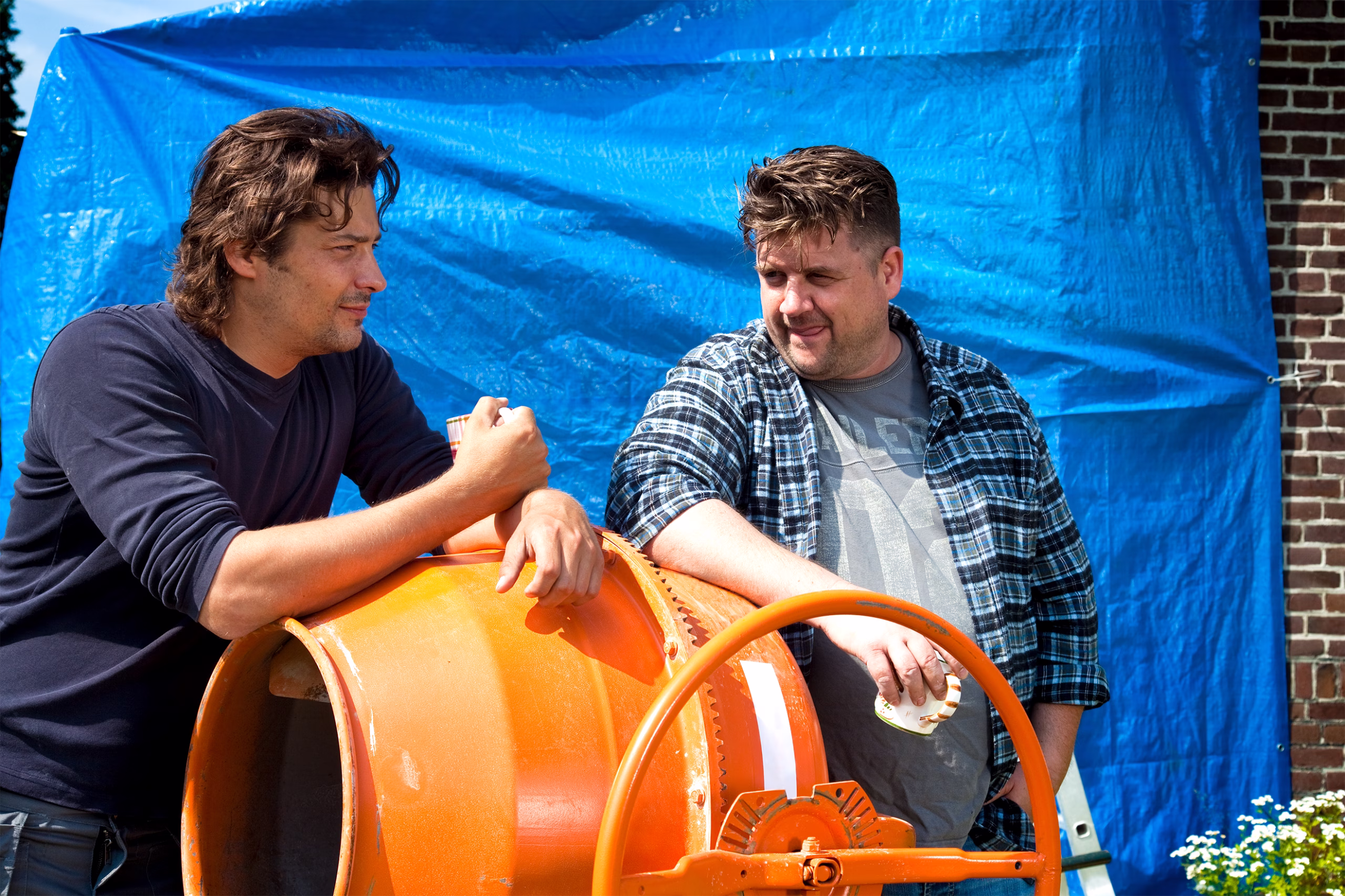
For Vereniging Eigen Huis, typography and photography carry the core of the identity. Every touchpoint needs to communicate clarity, warmth, and a straightforward attitude. Next to the visual language and custom typeface, we art-directed photoshoots that capture the full spectrum of homeownership, celebrating the everyday joys while also acknowledging the challenges. The combination of honest photography and distinctive typography ensures a cohesive visual language that feels both real and relatable.


What’s tough to explain, we made visible
To tackle complex topics, we developed a distinctive set of illustrations. Simple, direct, and full of character. These visuals bring abstract concepts down to earth, making them accessible and relatable. From clear, data-driven infographics to isometric house layouts, the illustration style forms a versatile toolbox that is used across campaigns, reports, and digital platforms.


Next project
Weaving perspectives.
What Design Can Do Delhi – Event Design, Identity, Motion, Typography